
Pearson Advance
Responsibilities: UX and UI design, pattern library & design system, page layout, site architecture
Pearson Advance was an early attempt by Pearson to enter the direct-to-consumer market for short courses and certificate programs. Unlike our usual online program management that focused on generating leads and continued student support for universities, Advance was to be a marketplace similar to Coursera wherein Pearson could market stand-alone courses, certificate programs, and other short-form education. The project was eventually subsumed by Pearson Pathways, but not before we had taken the Advance site to the first stage of testing and development.


Step 1: Research
Before design and development can even be thought of, we must start with the need to empathize with our users. I set out on an audit of user experience of the site, combing through every experience from every entry path I could surmise, including entry from an organic Google search, social ads, and PPC landing pages. I also did extensive research of competitors in this space, including top competitors such as Coursera and FutureLearn and other brands not necessarily focused on education like Brit+Co. I also examined popular e-commerce sites to better understand how other sites with massive catalogs handle their architecture and search patterns.
Establishing the problem
My findings led to a simple conclusion: it wasn’t just the site’s design that was lacking, it was a lack of content and a confusing sign-up process. By presenting next to no information about who and what this imprint of Pearson was, the site gave the user no reason to trust from the outset, then shot itself in the foot with a sign-in screen that changed the entire design and went through multiple domains.


Step 2: Wireframing & Brainstorming
Next, in collaboration with all the project’s stakeholders, we completed some sketching and wireframing exercises to establish our site map, content needs, and similar. I also compiled a moodboard at this stage to help stakeholders envision our new aesthetic direction. We smoothed out the account creation process, overhauled the site architecture and introduced verticals (category) pages, to help users quickly find content relevant to them. Finally, we established criteria for filters to allow users to do a deeper search than simple keywords.


Step 3: Design & Documentation
Working in an Agile flow with copy, development and other stakeholders to develop content across the site, we introduced more contextual information to the website in general, including partner logos on the homepage, and an About page to help build user trust.
Visually, we knew we had to be slightly more mature than the Pearson brand of the time, which was vibrant, illustrative, and generally geared more toward the K-12 audience, not our adult learners. We simplified our palette, and used color to actually reinforce our site’s architecture, by color-coding the programs based on their type: purple for bootcamps, green for individual, one-off courses, and Pearson blue for stackable credentials (meaning programs that could potentially lead into a full-degree from a university partners).

Homepage design. In addition to adding content to help potential users understand what this service was, we also wanted to ensure navigation was at the forefront of the page. We added a search bar directly to the hero, as well as direct links to the different vertical pages.

Main menu. We knew our menu had to have a relatively broad depth of choice, but this also runs the risk of overwhelming users by choice. To mitigate this, we chose to have our menu open full-screen, to help the user focus on only what’s relevant.

Program vertical page. By leveraging our newly established search criteria, our vertical pages would only have a touch of content to explain a concept, and consist largely of a pre-populated search, including sort and filtering options. CSS color overlays on the heroes would reinforce our color-coding.
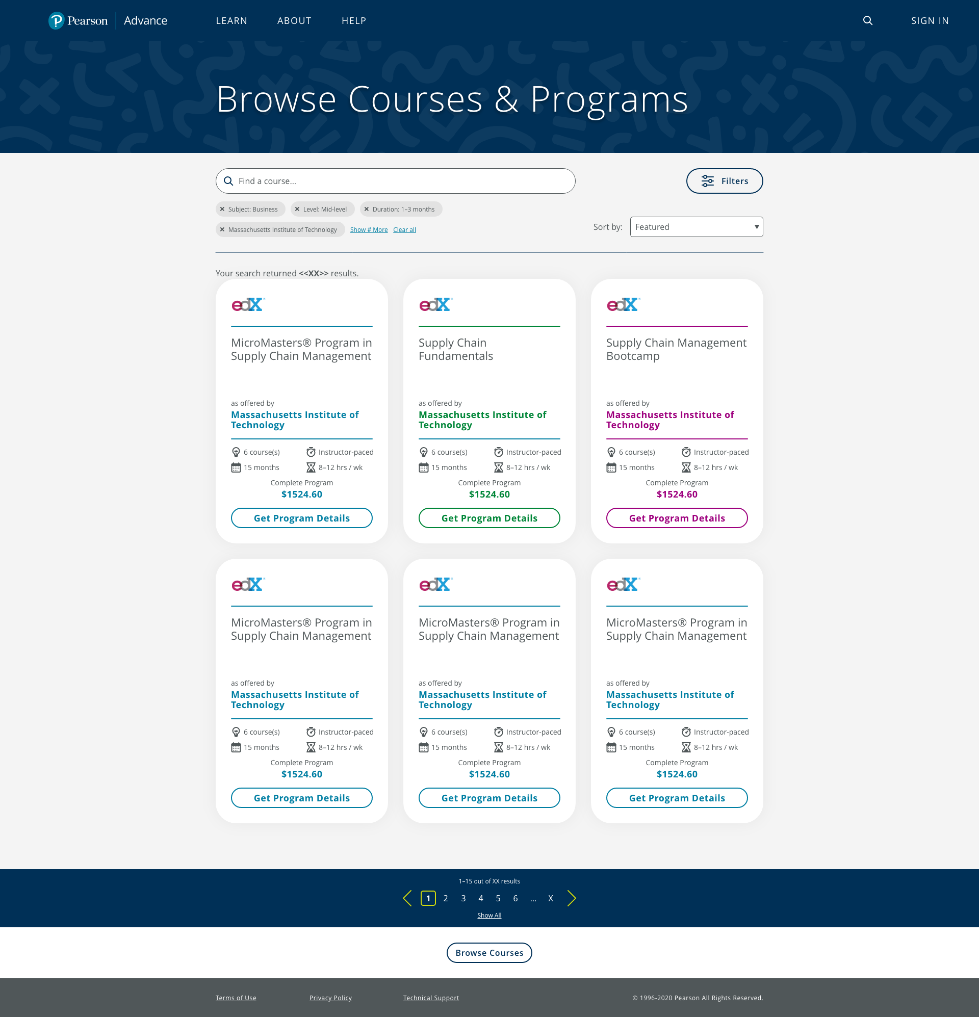
Search page. Our improved search would rely on cards to display the different programs available. From user testing, we learned that specific information about course cost and duration was always at the forefront of a potential student’s mind. so we wanted our search cards to provide that information quickly, to allow users to easily understand and compare key differences in programs.

Search filters. I drew a lot of UX inspiration for our filtering system from e-commerce sites like Amazon and Wayfair. Similar to Advance, these sites have massive catalogs that need to be whittled down based on a lot of differing criterias. I chose to put the search into a collapsible sidebar to reduce visual clutter and help users focus.

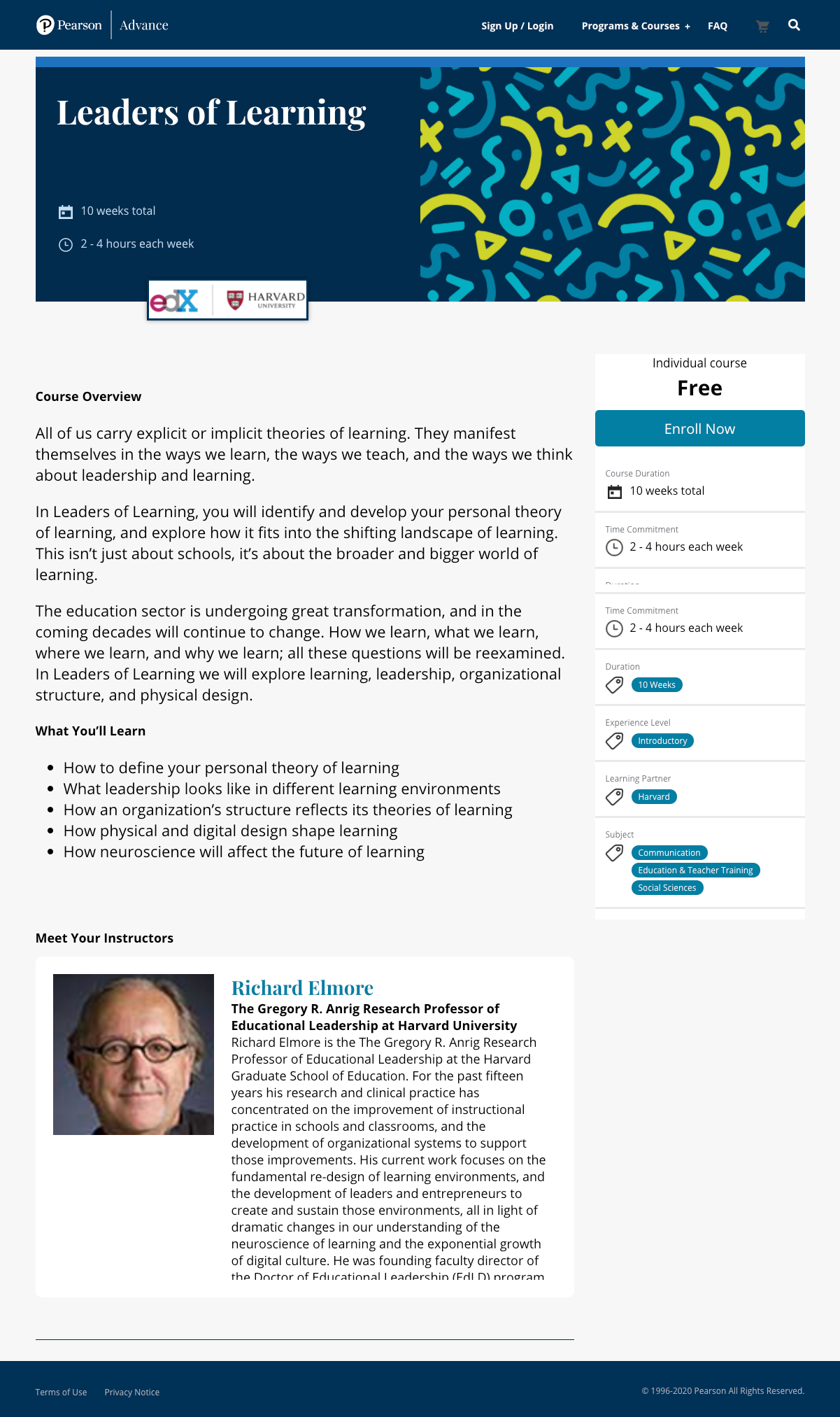
Program catalog page. For our programs, we established parameters for what the ideal page would and should include, such as program outcomes, industry information, a course list with links to the individual course. In the hero, we wanted to ensure we had the same high-priority information available as seen in the search cards, as well as an enrollment CTA for returning users ready to purchase.
For the UI kit, because we knew we would be working with a large variety of outside vendors for development, I wrote extensive documentation for design and development, including labeled diagrams of many components, and explanations for the logic behind the patterns. This process not only reduces future design debt, but forces me as the designer to confront possible problems in the user flow before they occur, and allows me to correct inconsistencies in the design system.


